
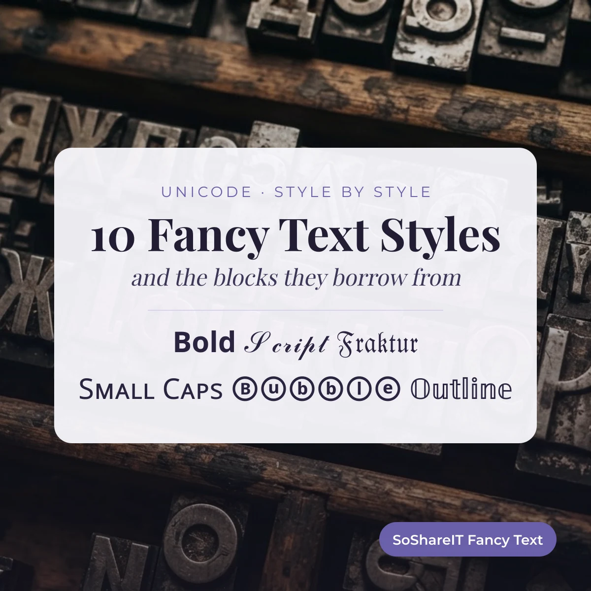
Fancy text is ordinary writing swapped for look-alike Unicode characters, and each of the 10 styles here borrows its letters from a named Unicode block, such as Mathematical Alphanumeric Symbols or Enclosed Alphanumerics. The block predicts whether a style renders on an old phone, survives a name field, or turns into boxes.
Pick a style under the box to switch the preview, then copy it. The rest of this page shows which block each style comes from and what that means for where it will work.
Last updated: 7 October 2026 · SoShareIT Fancy Text editorial team
Which block each style comes from
Unicode is organized into named blocks — contiguous ranges assigned to a purpose. The styles here are not fonts; they are letters borrowed from these blocks.
| Style | Block it draws from | Originally encoded for | Support |
|---|---|---|---|
| Bold | Mathematical Alphanumeric Symbols | Mathematical notation, where bold means a distinct variable | Good |
| Serif | Mathematical Alphanumeric Symbols | Same — the serif/sans distinction carries meaning in math | Good |
| Cursive / script | Mathematical Alphanumeric Symbols and Letterlike Symbols | Script capitals for named mathematical objects | Uneven — see below |
| Small caps | Phonetic Extensions and IPA Extensions | The International Phonetic Alphabet, for transcribing speech sounds | Good, but incomplete |
| Superscript | Superscripts and Subscripts, plus Phonetic Extensions | Footnote markers and phonetic notation | Good, but incomplete |
| Bubble | Enclosed Alphanumerics | Circled numbers and letters in East Asian typesetting | Good |
| Square | Enclosed Alphanumeric Supplement | Boxed letters used in signage and broadcast | Moderate |
| Old English / fraktur | Mathematical Alphanumeric Symbols | Fraktur letters used in German mathematics for ideals and algebras | Moderate |
| Upside down | IPA Extensions, Latin Extended, plus ordinary letters | Phonetic symbols that happen to look inverted | Good |
| Zalgo | Combining Diacritical Marks | Accents that attach to a base letter | Unpredictable by design |
Read that third column again. Not one of these blocks was created to make text look decorative. Every style here is borrowed from a scholarly or typesetting purpose, and the mismatch between what a character was for and what it is used for explains almost every problem people hit.
The script row is uneven for a specific reason. Eleven script letters, ℬ ℰ ℱ ℋ ℐ ℒ ℳ ℛ ℯ ℊ ℴ, were encoded years earlier in the Letterlike Symbols block (U+2100–U+214F), so the matching slots in Mathematical Alphanumeric Symbols were left empty on purpose. A word in cursive letters therefore mixes two blocks, and a font that covers only one of them draws a few letters in the wrong style.
Block names and ranges on this page follow the code charts published by the Unicode Consortium at unicode.org. The bold, serif, script and fraktur alphabets, for example, all sit in the Mathematical Alphanumeric Symbols chart (U+1D400–U+1D7FF).
The 9 alphabets side by side
The same word in each style, so you can see what the block actually produces. Tap any letter to copy it.
Bold
Italic
Cursive / script
Old English / fraktur
Serif
Small caps
Bubble
Square
Upside down
Why the block predicts the behavior
Font makers do not cover Unicode evenly. They cover what their users need, and the order is roughly: writing systems first, then widely used technical notation, then everything else.
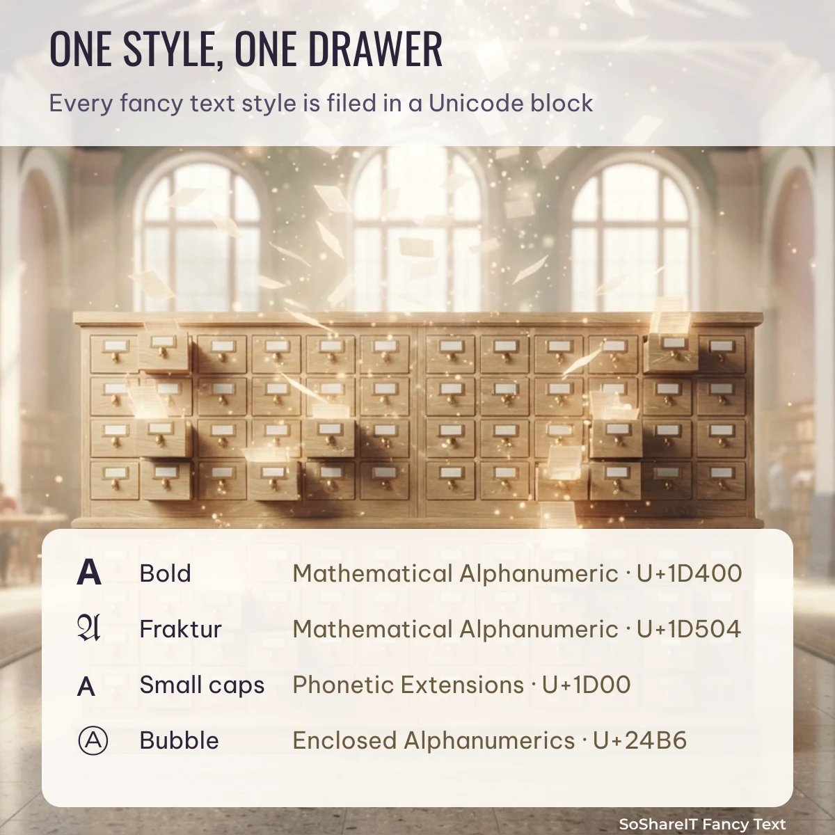
Mathematical Alphanumeric Symbols does well because mathematicians need it and it has been in the standard a long time. Phonetic Extensions does well for the same reason — linguists use it daily. Enclosed Alphanumeric Supplement does less well because far fewer people need boxed letters. That ordering is why bold survives on an old phone and square text sometimes does not.
The same logic runs the other way for name fields. A field that accepts only a restricted character set will accept ordinary letters and reject nearly everything from these blocks — which is why the upside-down style often survives where bold does not, since half of upside-down text is ordinary letters.
The one distinction that matters most
If you remember one thing from this page, make it this.
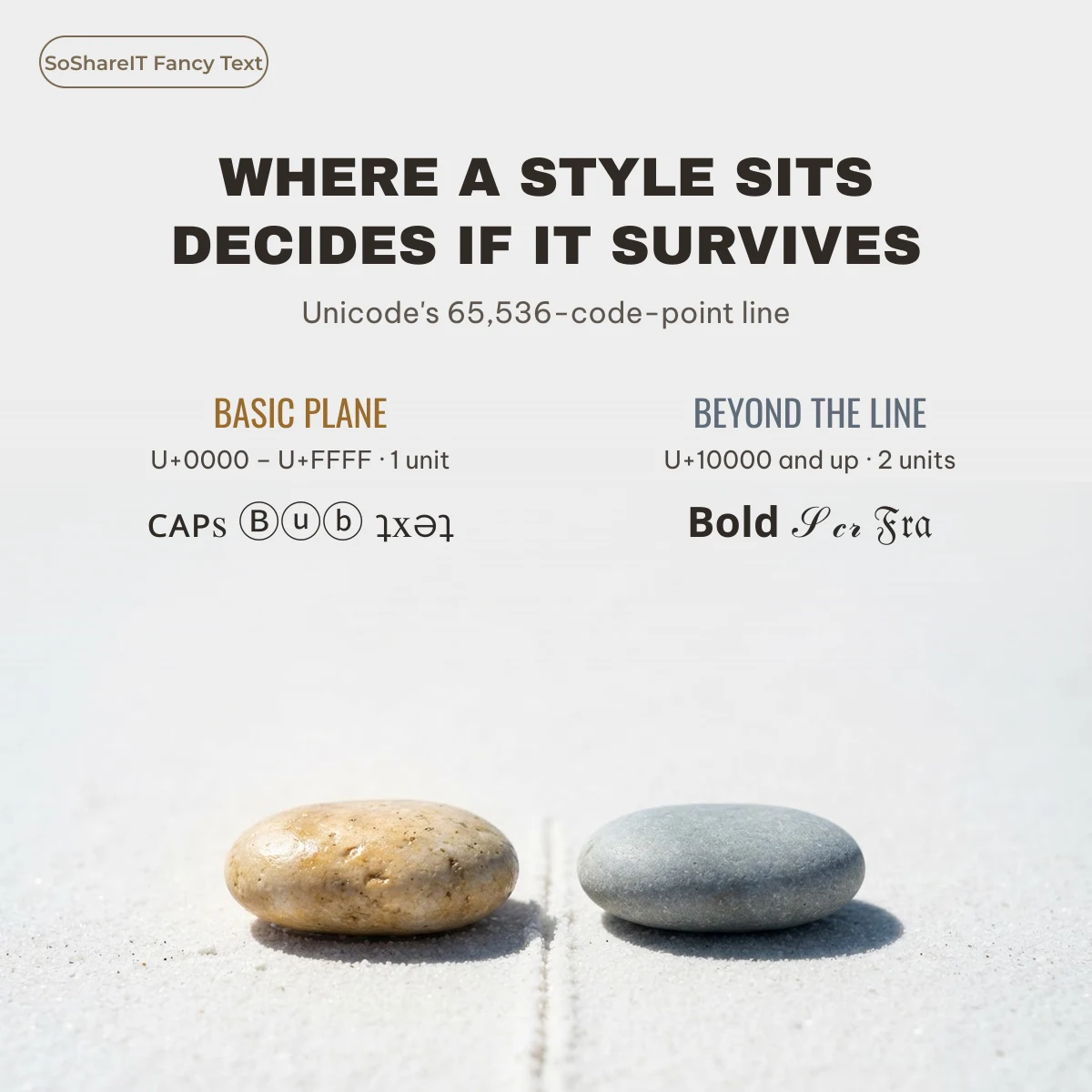
Unicode’s first 65,536 code points are called the Basic Multilingual Plane. Everything the standard needed most often lives there. Characters beyond it live in the supplementary planes, and a lot of older software was written assuming the basic plane was all there was.
Mathematical Alphanumeric Symbols is outside the basic plane. That single fact explains why bold, serif, script and fraktur are the styles most often rejected by name fields, why they count double toward character limits, and why they are the first to break on older systems.
Phonetic Extensions, Enclosed Alphanumerics and the combining marks are inside it. Small caps, bubble text and upside-down text are correspondingly more likely to be accepted.
That is not a rule about beauty. It is a rule about where the characters happen to sit, and it holds far more reliably than any guess based on how a style looks.
Using this to pick a style
- Name or username field? Prefer basic-plane styles — small caps, bubble, upside down. Bold and script are the most likely to be rejected.
- Bio or caption? Anything works. These fields rarely restrict character sets.
- Audience on older phones? Stay with Mathematical Alphanumeric bold and serif, or Phonetic small caps. Avoid the enclosed and ornamental ranges.
- Tight character limit? Basic-plane styles cost one unit per letter; supplementary-plane styles usually cost two.
You can test any of these blocks with your own words in the SoShareIT Fancy Text generator, then paste the result where you plan to use it before you commit to a username.
Our editorial policy explains how we test each style before publishing it, and why we would rather flag a style as fragile than let you discover it after setting your name.
FAQ
Are these fonts I can install?
No. They are characters, not fonts. There is nothing to install — you copy text and the receiving device draws it with whatever font it already has.
Why does one style work in a game and another does not?
The game restricts which characters its name field accepts, and the styles sit in different blocks. Basic-plane styles pass more often.
Which style is the safest overall?
Small caps, generally. It is inside the basic plane, comes from a well-supported block, and degrades gracefully because the letters still read as letters.
Why do styled letters count as two characters?
Characters outside the basic plane are stored as two units in the encoding most systems use, so a limit counted in units sees one letter as two.
Does the block affect how it looks?
Only through font coverage. The shape is drawn by the reader’s font; the block determines how likely that font is to have it at all.